Two Page Layout.
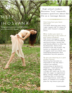
YAY! I finished my two page layout and it definitely wasn't as difficult as the table of contents. I skimmed through several different layout templates on Canva and chose all the ones I admired. After that I plugged in my photos and kept only the pages that looked good and gave me something to work with. The two page layout is a part of a three page article that is an interview of the dancer in my photos. I included a right-sided third page that is the beginning of the article with the title and then two following pages that continue the article. The two following pages are the two page layout were I kept the background neat and simple, white, and kept the text colors green and black. Green for questions and quotes, while black was for answers. The only problem I had was that the two page layout when put side my side it doesn't look as symmetrical as I'd like it to, so I'm going to have to go back and rearrange some things in order for this magazine to be truly complete. The article itself is a Q and A interview with questions about Izzy and her life in dance. I kept the font of the text simple, Monserrat Light, and the quotes bolder with Trocchi. The photos I chose all had similar settings, kept the color scheme continuing and displayed Izzy as a beautiful artistic dancer. Below are pages I've just mentioned:


Jt.
Comments
Post a Comment