Posts

Showing posts from April, 2017

Creative Critical Reflection

Screencast of my creative critical reflection on my portfolio project magazine. https://drive.google.com/open?id=0B3nkkbMt-0Z0R2hJdTl3UUxBazg  

The Final Product

StageLife the Magazine... Click "Keep Reading"

Extra Pages.

Image
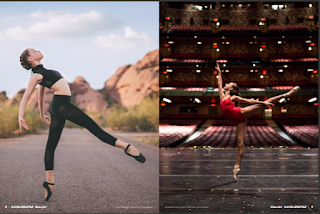
Well after finishing my two page layout, i was looking over all my pictures making sure i chose the correct ones to fit my magazine and as I was looking over my collection of photos, I decided that I had more options that I wanted to share. So, I created two more pages that serve as a display for the pictures, kind of like a portfolio that are typically done in art magazines. For example, Dance Lifestyle Magazine issues several pages dedicated to a specific dancer showcasing one photo per page. I left a caption at the bottom labeling who the photo is of and who it is by. Since this is technically an art magazine its wise to display the art, why not do it as clear and specific as you can? My choice of photos was one jump shot and one pose,the two compliment the dancer but also the photographer. These are probabley my favorite pages becuase the photos to me are so beautiful and I'm truly pleased with the idea of them being the focal point of a page. So here they are below.

Two Page Layout.

Image
YAY! I finished my two page layout and it definitely wasn't as difficult as the table of contents. I skimmed through several different layout templates on Canva and chose all the ones I admired. After that I plugged in my photos and kept only the pages that looked good and gave me something to work with. The two page layout is a part of a three page article that is an interview of the dancer in my photos. I included a right-sided third page that is the beginning of the article with the title and then two following pages that continue the article. The two following pages are the two page layout were I kept the background neat and simple, white, and kept the text colors green and black. Green for questions and quotes, while black was for answers. The only problem I had was that the two page layout when put side my side it doesn't look as symmetrical as I'd like it to, so I'm going to have to go back and rearrange some things in order for this magazine to be truly complete

Table of Contents Changed.

Image
   So as I said in by past "Table of Contents" blog, I wasn't really satisfied with the table of contents I originally came up with. The colors were too bright and juvenile while the cover of the magazine was vibrant with natural colors and more mature. I made another table of contents that fit what I was looking for, but its still wasn't doing it for me. So as I took the time to think it over I decided to start from scratch for the third time.A friend of mine guided me to a magazine website called Issuu  where I found an assortment of dance magazine examples. A magazine called Dance LifeStyle was the prime example of my magazine it had everything I already mentioned I want my magazine to contain,the interviews with a dancer, the must haves, and photography portfolios. For example:  So as I was skimming through the magazine I kept an eye open for an interesting table of content and each issue had one, the table of contents had a beautiful model in a scenic spot